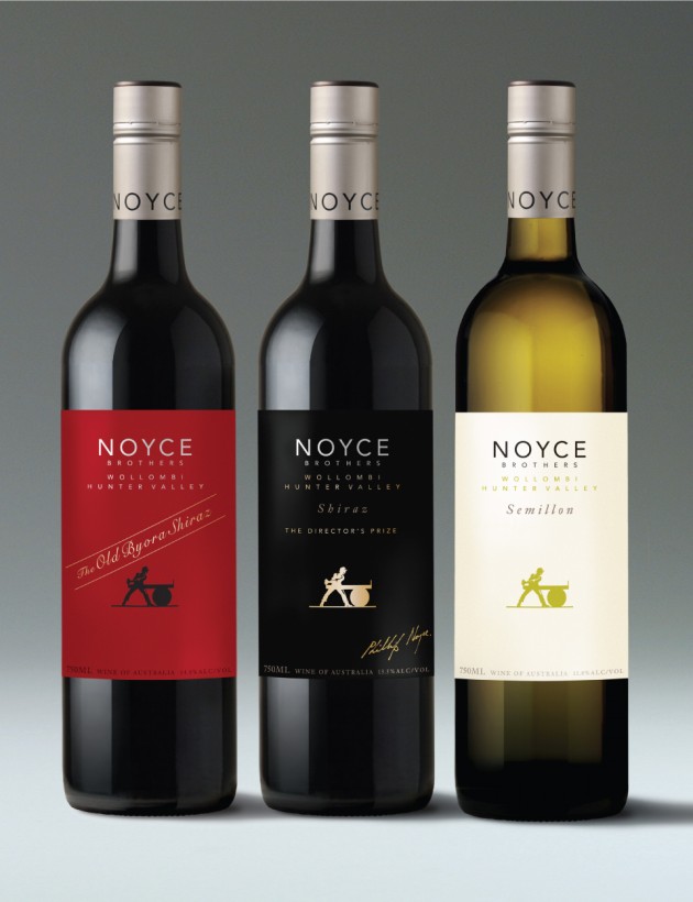
Noyce Brothers
Client: Noyce Brothers Wine
Location: Wollombi, New South Wales, Australia
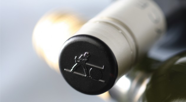
Scope: Brand creation and design, label design, closure design, typography, illustration, artwork
Team: Mike Heine, Kim Beckers, Krista Malloch, Anthea Lemmer
More >
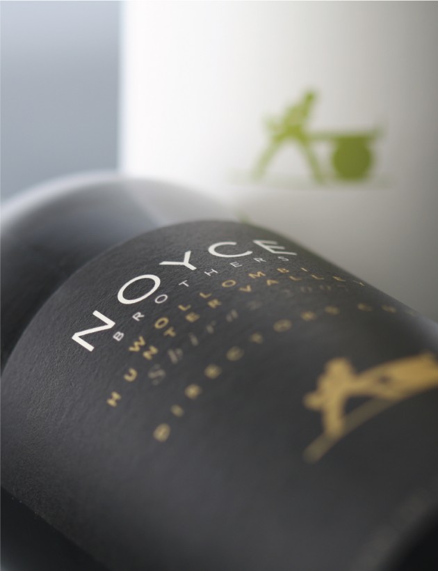
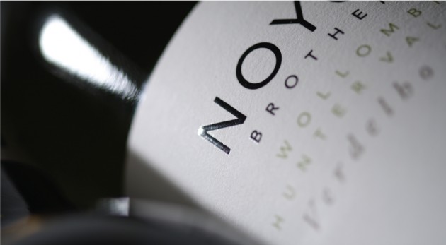
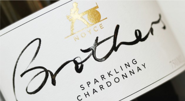
HeineJones worked closely with the Noyce brothers to reinvent the Noyce Brothers brand. The brand had previously been presented poorly, with a dated label design which portrayed the product at a level well below its true quality.
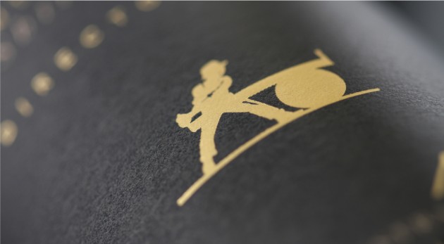
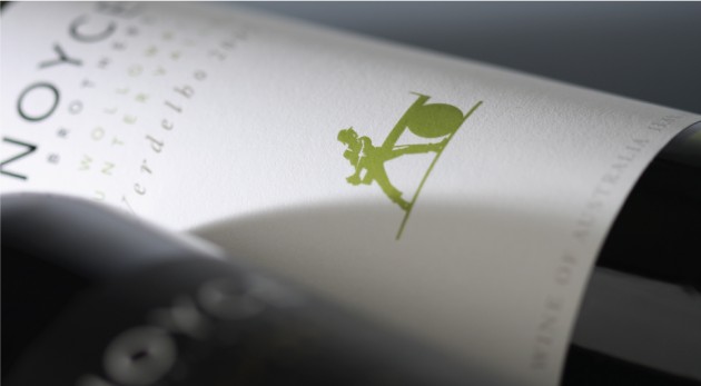
After carefully researching the history of the area in which the winery is located, HeineJones uncovered a fascinating history of convicts, early settlers and timber industry workers – this was used to create the visual essence of the brand – which is well aligned with the visual heritage of the Wollombi township.
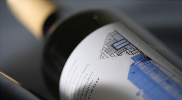
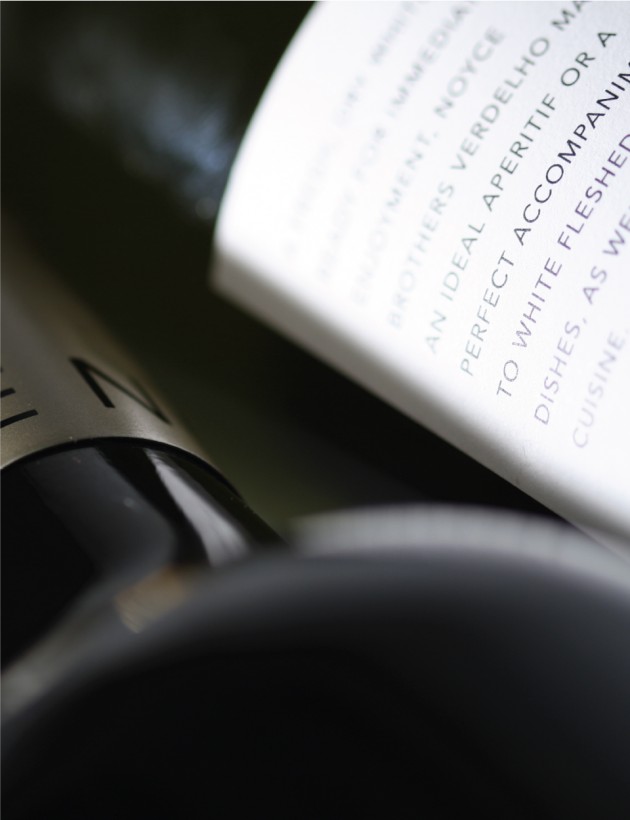
When the new brand was introduced sales immediately increased, the perceived product value was increased significantly and customers reactions to the revitalised brand were overwhelmingly positive. Designed to present with an authority and sense of value, the formality of the front label is countered with a more relaxed and compelling back label imagery.
< Less
