Canberra Wayfinding and Interpretive
Client: National Capital Authority
Location: National Capital Authority Estate, Canberra, Australia
Scope: Wayfinding Strategy; Signage design and manual; Tourist Road Sign Report
Team: Mike Heine, Steve Jones
More >
HeineJones collaborated with the
National Capital Authority (NCA) to provide research, wayfinding, and signage design services, culminating in the creation of the
NCA Wayfinding Strategy Report and
NCA Signage Manual.
The NCA sought to enhance wayfinding and signage throughout its estate while establishing guidelines for appropriate interpretation and communication levels suited to the estate’s character. The NCA’s mission is to promote the Capital and foster a deeper understanding and appreciation of Canberra as the National Capital. It was recognised that effective interpretation and wayfinding would encourage participation, appreciation, and celebration within the National Capital. The signage needed to inform and educate about the Capital and promote aspects of Canberra with national significance
HeineJones developed a visual wayfinding system that operates on multiple levels, aiding people in finding their way and orienting themselves. This system considered the city’s layout, topography, landscape, local landmarks, architecture, lighting, and orientation points. The project equipped the NCA with the necessary policy, framework, guidelines, and elements to apply the signage system effectively.
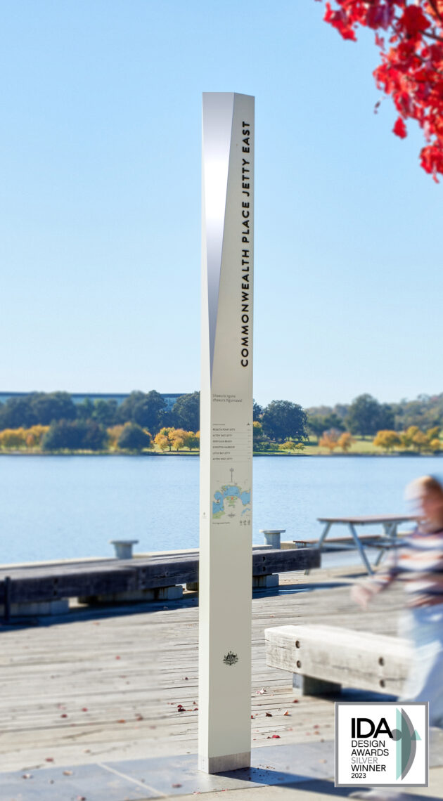
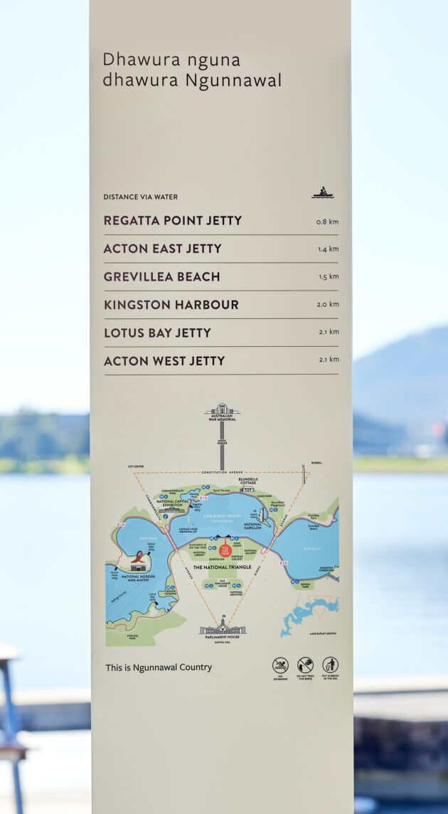
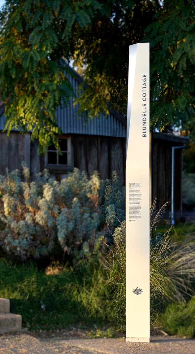
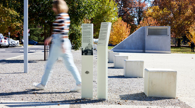
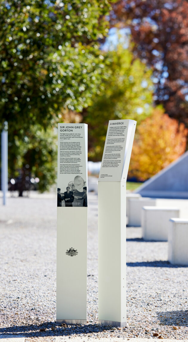
The design aimed to harmonize with the surrounding built landscape in terms of importance, scale, and colour. Tall tower-like forms mirrored the sandstone hues featured in many national monuments’ architecture in Canberra. Wayfinding signs were designed to be visible from a distance, offering clear directions and user-friendly maps to assist the public in navigating the National Capital Estate. The National Triangle, a central precinct within the Estate, was represented as a shining triangular facet, a design element that was consistently used across the entire suite of signs. Additionally, a suite of interpretive signs seamlessly blended with the landscape’s character, offering visitors historical content and images of national significance. Signs were strategically scaled and positioned to align with interpretive subjects, ensuring they enhanced rather than overwhelmed the visitor experience.
< Less
